Using POS data the right way: 7 insights hidden in your checkout data
Every transaction at your checkout generates data. Item, time, quantity, price, payment method. Millions of data points that usually do just one thing: gather dust in the archive. Yet these numbers hold answers to questions you may not even have asked yet.
This article shows seven concrete insights you can draw from your POS data. No abstract analytics concepts, but practical findings with direct value for assortment, staffing and revenue. For each insight, you will learn how to find it – and what you can do with it.
1 – The true peak times of your stores
You think you know when your stores are busiest. But do you really? Staff perception and actual transaction numbers often diverge surprisingly.
POS data shows exactly on which weekdays, at which times and in which calendar weeks the most transactions take place. And it shows more: not just the number of transactions, but also the average receipt. Sometimes the quiet midday period is more profitable than the hectic after-work rush.
How to find it: Export transaction data with timestamps. Group by weekday and hour. Compare transaction count and average receipt.
How to use it: Optimize staff planning – more employees in true peaks, fewer in perceived ones. Place promotions in high-revenue periods, not high-traffic ones.
2 – Products that sell each other
Classic market basket analysis: which items are bought together more often than average? The diapers-and-beer example is legendary, even if it was never proven. But genuine product affinities exist – and they are gold.
A DIY store discovers that customers who buy wall paint also buy brushes in 80% of cases, but drop cloths in only 30%. A drugstore finds that hair dye and hair treatments rarely end up in the same basket, even though the combination would make professional sense. Each of these insights is a lever.
How to find it: Calculate the lift value for product pairs. A lift above 1.0 indicates a frequency beyond chance. Focus on non-obvious combinations.
How to use it: Optimize placement. Create bundle offers. Serve cross-selling hints on the digital receipt. Train staff on complementary products.
3 – Basket size by customer type
Not every customer is the same – checkout data shows this clearly. There is the quick shop with three items and the big shop with fifty. The early shopper, the midday shopper, the evening shopper. Each type behaves differently.
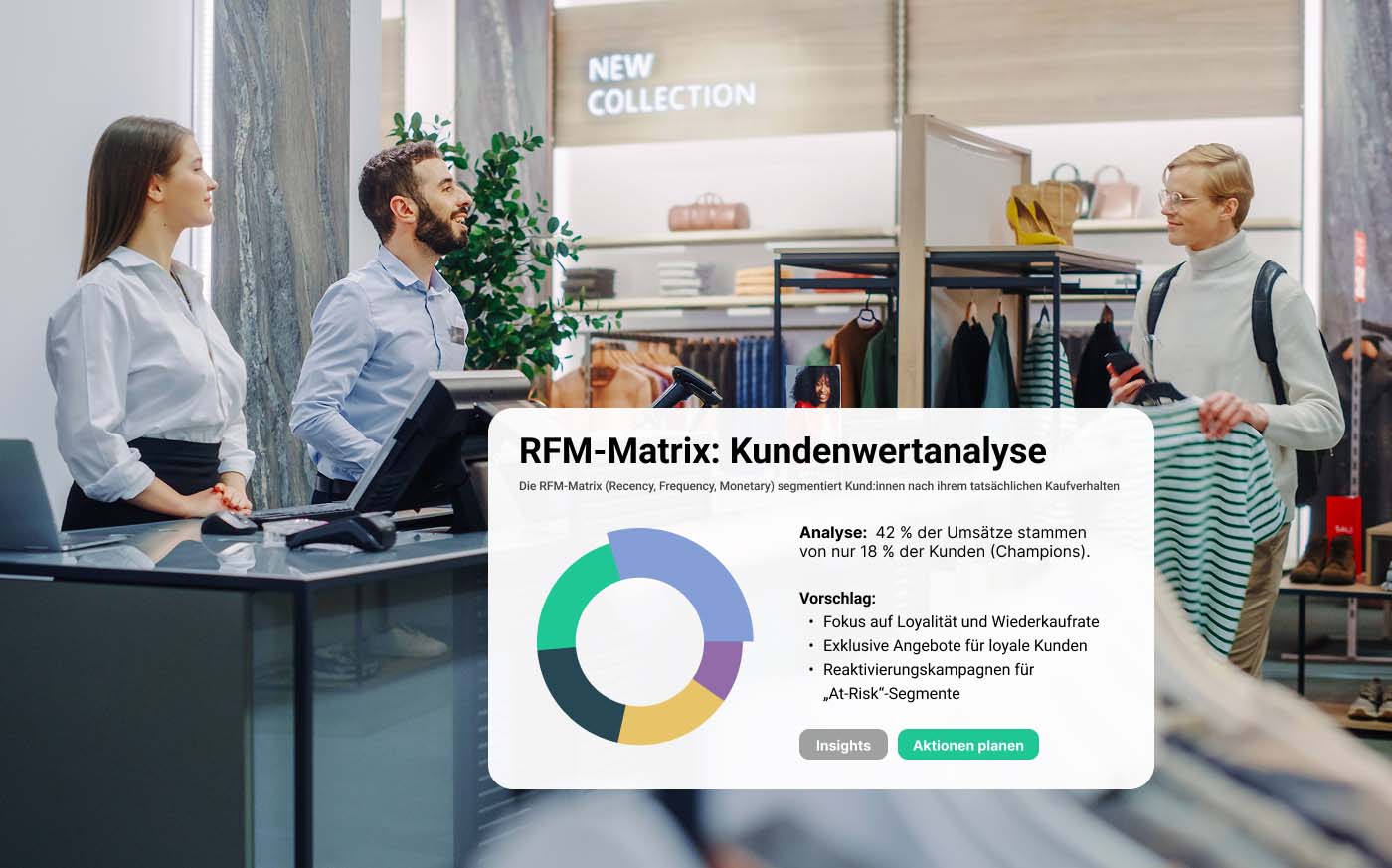
Without a loyalty card, you cannot identify individual people. But you can recognize transaction types. What percentage of your transactions are baskets under €10? How many are over €100? How do these groups differ by time of day, weekday and product categories?
How to find it: Segment transactions by receipt value. Analyze the distribution. Compare average item count and categories per segment.
How to use it: Targeted measures per segment – for small-basket shoppers: impulse-buy zones at the checkout. For large-basket shoppers: loyalty programs that only pay off at high receipt values.
4 – Seasonal patterns you did not expect
The fact that sunscreen sells better in summer than in winter is not an insight. But your POS data shows subtler patterns: which categories rise two weeks before a public holiday? Which drop in the first week of January? Which correlate with school holidays or weather data?
A grocery retailer discovers that organic products grow more strongly in the first half of the year – an after-effect of New Year's resolutions. A DIY store finds that garden tools peak not in spring, but already in February, when customers are planning.
How to find it: Compare category revenues over 12–24 months. Identify outliers. Correlate with external factors such as public holidays, school holidays and weather.
How to use it: Adjust order quantities before the season starts. Time promotions more precisely. Plan advertising materials in advance instead of reacting.
5 – The performance of individual checkout zones
If you have several checkouts, the data shows more than just waiting times. It shows which checkout zone generates which revenue. Are there differences? Are more impulse items sold at certain checkouts? Is the average receipt at the express checkout lower than at a regular one?
This information is rarely evaluated, but it is revealing. A supermarket finds that the checkout next to the bakery consistently has higher receipts. A fashion retailer discovers that add-on sales almost only happen at checkouts with an impulse-goods display.
How to find it: Group transactions by checkout ID. Compare average receipt, item count and category mix per checkout.
How to use it: Optimize the checkout environment. Transfer successful setups to other checkouts. Rethink staff assignment.
6 – Price thresholds and price sensitivity
At what price does demand drop off? Are there magic thresholds such as €9.99 vs. €10.00? Your POS data can show this if you correlate price and sales volume.
Particularly revealing are products whose price has changed. How did sales develop? Was the increase from €4.99 to €5.49 neutral, or did it suppress demand? This data is more valuable than any market research because it shows real buying behavior.
How to find it: Analyze products with price changes. Compare sales before and after. Account for seasonal effects and availability.
How to use it: Optimize pricing. Test increases before rolling them out across the board. Understand price elasticity by category.
7 – Items that are never sold together
Most analyses look for products that are bought together. But the opposite is just as interesting: which products are almost never found in the same basket, even though they actually belong together?
These negative correlations reveal missed opportunities. An electronics retailer discovers that customers who buy printers rarely take cartridges with them – they are presumably bought elsewhere later. A sports shop finds that running shoes and running socks end up in the same basket in only 8% of cases.
How to find it: Identify product pairs that logically belong together. Check how often they are actually bought together. Low values are warning signs.
How to use it: Review placement. Active recommendation by staff. A reminder on the digital receipt: "Did you think of XY?"
The 7 insights at a glance
- True peak times – timestamps + receipt value → optimize staff planning
- Product affinities – basket contents → improve cross-selling & placement
- Basket size by type – receipt value + item count → refine customer segmentation
- Seasonal patterns – category + time period → plan orders & promotions in advance
- Checkout zone performance – checkout ID + revenue → optimize the checkout environment
- Price thresholds – price + sales volume → steer pricing on the basis of data
- Missed combinations – negative correlations → capture lost opportunities
Conclusion: you already have the data
These seven insights are not a vision of the future. They are sitting in your checkout data – today, now, ready to retrieve. What is often missing is not the technology, but the time and know-how to unlock them.
Getting started does not have to be complicated. Pick one of the seven insights. Export the relevant data. Set aside two hours for a first analysis. The results will surprise you.
And if you find that manual analyses are reaching their limits – there are solutions that automate this.
Analyzing POS data automatically – with Purchase Intelligence
anybill Purchase Intelligence makes these seven insights available automatically. The platform connects to your POS system, analyzes transaction data and delivers product affinities, time analyses and recommended actions. No export, no Excel, no waiting.
Weitere Blogbeiträge